

Give teams one picture of progress
Imagine opening September's delivery view and seeing the same agreed commitments that each team is tracking. A department head can discuss overall progress while a team lead can locate the work behind the percentage.
That consistency depends on a shared definition. Agree which commitments belong to the month and what counts as accepted delivery. Keep the reporting period and last update visible, so everyone knows which picture they are using.
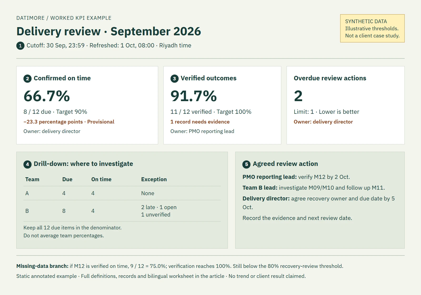
Synthetic example: a service business has 12 project milestones due in September. Eight were accepted on time, two were accepted late, one remains open and one acceptance record is unverified. These are demonstration data, not client results.
See where support is needed
The dashboard shows 66.7% confirmed on time: 8 of the 12 milestones due. All commitments stay visible, including the open and unverified ones. Beside the rate, the team can see the agreed target and who owns delivery performance.
This gives managers a more useful starting point for support. The team lead can investigate the two late milestones and plan the remaining work, while the reporting lead checks the missing acceptance evidence. A missing document does not have to send the delivery team towards the wrong recovery action.
If that evidence confirms acceptance by the deadline, the rate becomes 75%: 9 of 12. Mark the original result as provisional until the check is complete. The revised figure corrects the record; it is not a new improvement in delivery.
The view helps people locate the work that needs attention. Understanding the cause still requires a conversation with the team before changing resources or processes.
Keep progress visible between reviews
The improvement continues after the meeting when agreed actions appear alongside the delivery view. In this example, the team lead is responsible for agreeing a recovery action for the open milestone by 5 October. Once owners record their updates, the next review can start with what changed, what remains open and where further help is needed.
Start with one measure and one recurring review. A dashboard becomes useful through maintained records and visible follow-up, not through the chart alone.
Explore the annotated synthetic dashboard or download the bilingual definition worksheet (.xlsx). Both use the same example; the workbook is a planning aid, not a production reporting system.
Datimore can help build a shared management reporting view around your agreed measures and review routine. Our enterprise performance management case shows objectives, KPIs and initiatives brought together. The aim is a clearer view of progress that your team can use and keep current.